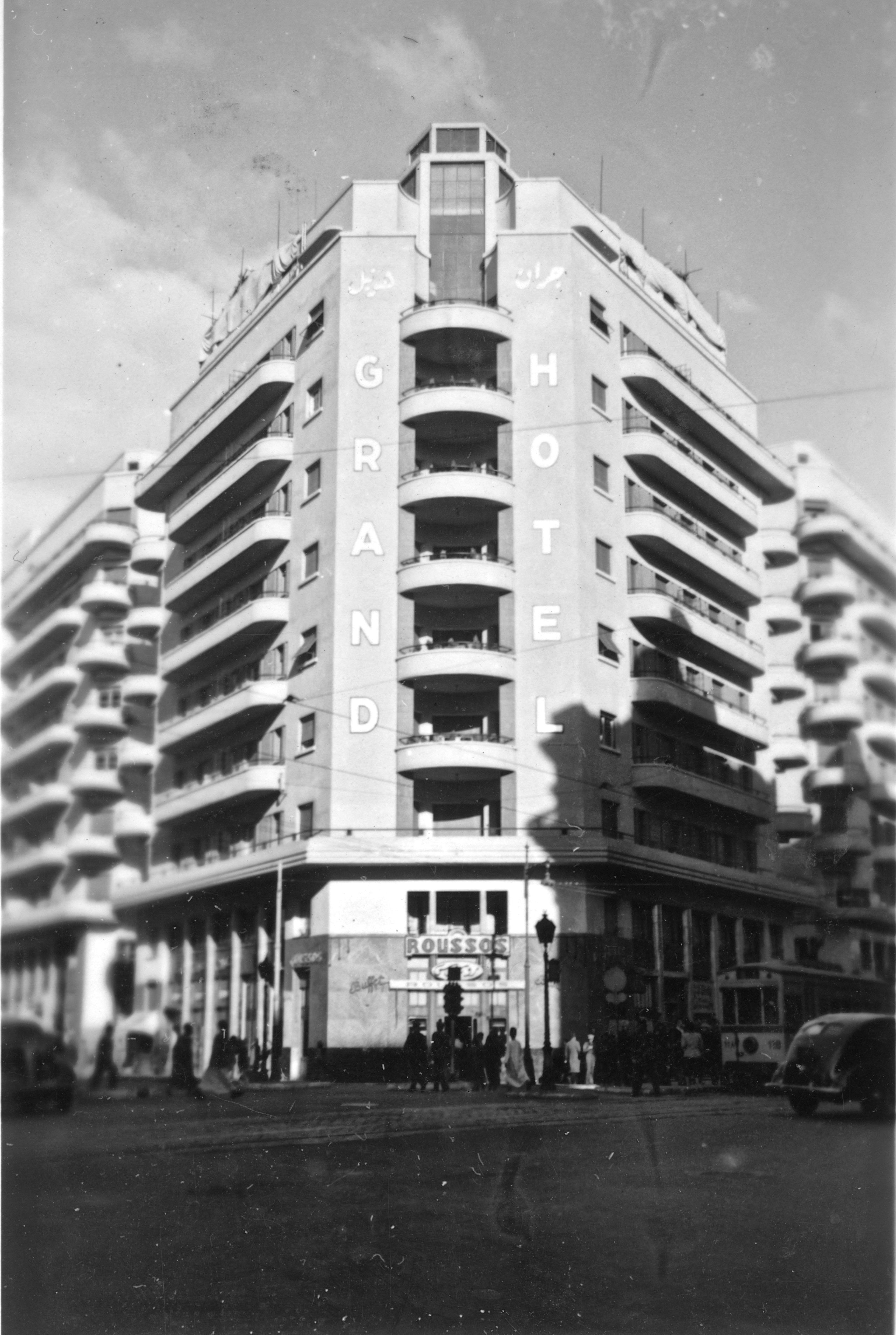
I found this photo of the Grand Hotel in my father’s war album, from his time in Egypt in 1941/42 with the AIF. The hotel in central Cairo is part of the Gamalian complex built in 1939, designed by Kamal Ismail. At street level are the hotel foyer and shops, above them is a mezzanine level of offices, and then eight floors of apartments. The complex is an excellent example of stark modernist architecture with its streamlined, symmetrical arrangement of facade details, repetition of balconies, rounded corners, simple balustrades and lack of ornamentation.
On the right and left of the photo where it is out of focus there are small corner balconies on separate buildings, between which there are three pedestrian walkways leading to a central rotunda. The walkways these days are blocked with shops and stalls, but they were designed to allow natural ventilation and illumination between the three parts of the complex, as you can see in the layout plan below the photo.


I found the plan at archnet.org in a very interesting article, “Gamalian: a rediscovery”, about the design and innovations in the complex. The author laments the deterioration of the buildings since their construction in 1939.
Thanks to the Daily Post for this photo challenge.
*****


